Balancing Form and Function

In design, the tension between beauty and utility is as old as the craft itself. Yet the most enduring work—whether a chair, a website, or a city plaza—achieves a quiet harmony where form and function are not rivals but partners. This article explores how designers can navigate that balance, with practical insights drawn from architecture, product design, and digital interfaces.
The False Dichotomy
The phrase “form follows function” has been repeated so often it has become a design cliché. Coined by architect Louis Sullivan in the late 19th century, it was a reaction against ornament for its own sake. But taken too literally, it implies that function always leads and form merely follows—a hierarchy that overlooks the emotional and cultural power of aesthetics. In reality, form and function are intertwined; a well-designed object communicates its purpose through its shape, material, and color before a user ever interacts with it.
Consider the humble door handle. Its function is simple: to open a door. Yet the best handles do more—they invite the hand, signal push or pull through their geometry, and even convey the character of the building. A sleek, minimalist lever in brushed steel suggests modernity; a heavy brass knob evokes tradition. The function is identical, but the form shapes our experience and expectation. The dichotomy is false because neither can exist meaningfully without the other.
Lessons from Architecture and Product Design
Architecture has long grappled with this balance. The Bauhaus school championed functionalism, yet its buildings were also striking compositions of glass, steel, and concrete. The Barcelona Pavilion by Mies van der Rohe is a masterclass: its open plan and flowing spaces serve the function of circulation and exhibition, while its luxurious materials and precise proportions create an almost spiritual calm. The form does not merely follow function; it elevates it.

In product design, Dieter Rams’ ten principles for good design remain a touchstone. Rams insisted that good design is unobtrusive, honest, and long-lasting—but also aesthetic. His work for Braun, such as the T3 pocket radio, demonstrates that a product can be both supremely functional and visually iconic. The clean lines and simple controls are not just attractive; they make the product easier to understand and use. The form clarifies the function.
“Good design is as little design as possible—but that ‘little’ must be exactly right.” — adapted from Dieter Rams
Digital Interfaces: Where Usability Meets Delight
In web and app design, the balance between form and function is especially acute. A visually stunning interface that confuses users is a failure, but a purely utilitarian one that ignores aesthetics feels cold and untrustworthy. The best digital products weave beauty into usability: thoughtful typography, generous whitespace, and subtle motion guide the eye and reduce cognitive load. These are not decorative flourishes; they are functional elements that make the experience intuitive.
Take the evolution of mobile operating systems. Early smartphones prioritized function over form, with dense menus and tiny icons. As touchscreens matured, designers realized that larger, more tactile elements and fluid animations were not just prettier—they were easier to use. The “form” of a button—its size, shape, and shadow—directly affects how accurately and quickly users can tap it. In digital design, aesthetics and ergonomics are inseparable.
For more on how visual trends can enhance rather than hinder usability, see our piece on The Rise of Neon in UI. And for broader insights into design thinking, visit Latest Insights.
Finding the Balance: A Practical Framework
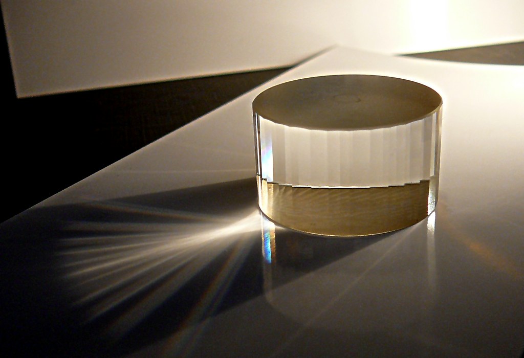
How can designers achieve this balance in their own work? It begins with a clear understanding of the user’s needs and the context of use. Function should be defined not as a checklist of features, but as the core job the design must accomplish. Form should then be explored not as decoration, but as the most elegant expression of that job. The goal is a design where every visual choice has a reason, and every functional requirement is met with grace.
- Start with the user: Observe how people actually interact with similar products. Where do they hesitate? What delights them? Use these insights to define the functional constraints.
- Prototype early and often: Low-fidelity prototypes help test function without the distraction of visual polish. High-fidelity prototypes reveal how form affects perception and usability.
- Iterate on both axes: Don’t treat form and function as sequential phases. Refine them together, asking: “Does this visual choice improve clarity? Does this functional requirement allow for a more elegant form?”
- Seek simplicity: The best designs often emerge when you remove elements until nothing superfluous remains. Simplicity is not the absence of form; it is form perfected.
Case Study: The Evolution of the Smartphone
The smartphone is a perfect case study in balancing form and function. Early devices like the BlackBerry prioritized physical keyboards for efficient typing—a clear functional win. But the iPhone’s all-screen form, while initially criticized for its lack of a physical keyboard, proved more versatile. Its large touchscreen allowed the interface to adapt to different functions—typing, gaming, video—within a single, elegant form. The form enabled new functions that a fixed keyboard could not.
Yet the iPhone’s success was not just about the screen. Its rounded corners, smooth glass, and precise weight distribution made it a pleasure to hold. These aesthetic choices had functional benefits: the rounded edges prevented discomfort during long use, and the glass felt premium, encouraging careful handling. The form and function were designed together, each reinforcing the other.
The Role of Emotion and Culture
Function is often measurable—speed, efficiency, durability—but form operates on a deeper, emotional level. A well-designed object can evoke joy, nostalgia, or trust. These emotions are not frivolous; they influence how we use and value products. A chair that is comfortable but ugly may be used, but it will not be loved. A beautiful chair that is uncomfortable becomes a sculpture, not furniture. The balance lies in creating objects that are both useful and emotionally resonant.
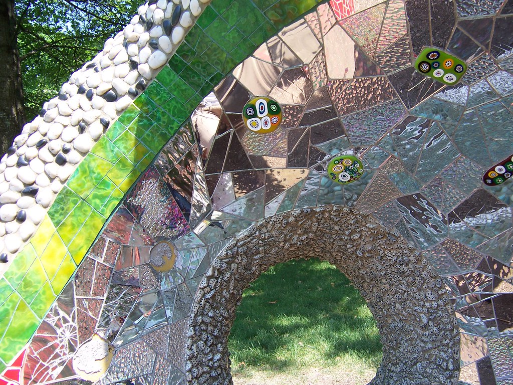
Culture also shapes this balance. In some contexts, ornate form is a sign of quality and care; in others, minimalism signals sophistication. Designers must understand the cultural codes of their audience. A website for a luxury brand may favor dramatic visuals and slow, cinematic transitions, while a banking app must prioritize speed and clarity. Both are valid approaches; the balance shifts with context.
Conclusion: Harmony, Not Compromise
Balancing form and function is not about making compromises—it is about finding a harmony where each enhances the other. The most memorable designs are those where you cannot imagine the form without the function, or the function without the form. They feel inevitable, as if they could be no other way. Achieving that inevitability requires deep empathy for the user, a willingness to iterate, and a respect for both the practical and the poetic. In the end, the best design is not just something that works; it is something that works beautifully.