Selected Works

Ricardo Arturo Cabral is a multidisciplinary designer whose work bridges the gap between digital precision and human emotion. This portfolio presents a curated selection of projects spanning user interface design, generative art, and brand identity. Each piece reflects a commitment to clarity, experimentation, and the belief that design should not only solve problems but also provoke thought and feeling.
Design Philosophy
At the core of Ricardo's practice is a simple principle: every pixel must earn its place. This means stripping away the unnecessary, questioning every visual element, and ensuring that form follows function without sacrificing beauty. His work often begins with extensive research into user behavior, cultural context, and the emotional resonance of color and typography. The result is design that feels both inevitable and surprising—familiar enough to be intuitive, yet distinct enough to be memorable.
Ricardo draws inspiration from a wide range of sources: the clean geometry of Swiss modernism, the playful experimentation of the Memphis Group, and the quiet sophistication of Japanese minimalism. He believes that the best design is invisible in its function but unforgettable in its presence. This philosophy is evident across all his projects, whether he is crafting a complex dashboard interface or a single logo mark.
"Design is not just what it looks like and feels like. Design is how it works—and how it makes you feel while it works."
User Interface Design
Ricardo's approach to UI design is rooted in the belief that interfaces should be transparent. A user should never have to think about how to navigate a screen; the path should be obvious, the feedback immediate, and the experience seamless. This is particularly challenging in data-heavy applications, where the risk of overwhelming the user is high. Ricardo tackles this by establishing clear visual hierarchies, using whitespace strategically, and employing micro-interactions that guide without distracting.
One notable example is the Neon Dashboard UI, a project that reimagines how analytics can be presented. Instead of a sea of charts and numbers, the interface uses a dark theme with neon accents to draw the eye to the most critical metrics. The layout is modular, allowing users to customize their view without losing coherence. This project demonstrates how aesthetic choices can enhance usability rather than compete with it.
Key Principles in UI Work
- Clarity over decoration: Every visual element serves a purpose; if it doesn't aid comprehension, it is removed.
- Consistency in motion: Animations and transitions follow a unified language, making interactions predictable and satisfying.
- Accessibility as default: Color contrast, font sizes, and touch targets are designed to meet WCAG standards from the start, not as an afterthought.
Generative and AI Art
Beyond traditional design, Ricardo explores the intersection of art and technology through generative systems and artificial intelligence. He views AI not as a replacement for human creativity but as a collaborator—a tool that can surface unexpected patterns and push the boundaries of what is visually possible. His work in this area often involves writing custom algorithms that generate unique compositions, each iteration a one-of-a-kind piece that cannot be replicated.
The AI Art Installation is a prime example. This project used a neural network trained on thousands of abstract paintings to create an ever-evolving digital mural. The installation responded to the movements of viewers, altering colors and shapes in real time. The result was a living artwork that blurred the line between creator and audience, raising questions about authorship and the role of the machine in art.
Ricardo's generative work is not limited to gallery settings. He applies the same principles to commercial projects, using procedural generation to create unique brand assets, dynamic backgrounds for websites, and even personalized marketing materials. This approach ensures that no two pieces are ever exactly alike, giving each client a truly bespoke result.
Brand Identity and Visual Systems
A strong brand is more than a logo; it is a complete visual language that communicates values, personality, and promise. Ricardo approaches brand design holistically, considering every touchpoint from business cards to social media templates. He believes that consistency is key, but so is flexibility—a brand must be able to adapt to different contexts without losing its core identity.
The Brand Redesign for Café illustrates this balance. The original café had a charming but inconsistent visual presence. Ricardo developed a new identity centered around a custom wordmark and a warm, earthy color palette inspired by the café's artisanal coffee. He then created a comprehensive brand guide that included usage rules, typography pairings, and a library of graphic elements. The result was a cohesive brand that felt both modern and inviting, leading to increased customer recognition and loyalty.
Elements of a Successful Brand System
- Logo suite: Primary, secondary, and favicon versions for all sizes and contexts.
- Color palette: A primary palette with supporting neutrals and an accent color for highlights.
- Typography: A clear hierarchy with a display face for headlines and a readable face for body text.
- Imagery style: Guidelines for photography, illustration, or iconography to ensure visual harmony.
- Voice and tone: Written guidelines that align the brand's language with its visual identity.
Collaboration and Process
Ricardo believes that the best work emerges from close collaboration with clients and fellow creatives. His process is transparent and iterative, involving stakeholders at every stage. It typically begins with a discovery phase, where he immerses himself in the client's world—understanding their goals, audience, and competitive landscape. This is followed by research and moodboarding, where visual directions are explored and refined.
Once a direction is chosen, Ricardo moves into design sprints, producing rapid prototypes and gathering feedback early and often. This agile approach minimizes risk and ensures that the final product truly meets the client's needs. He is also a strong advocate for design documentation, creating detailed specs and style guides that make handoff to developers smooth and error-free.
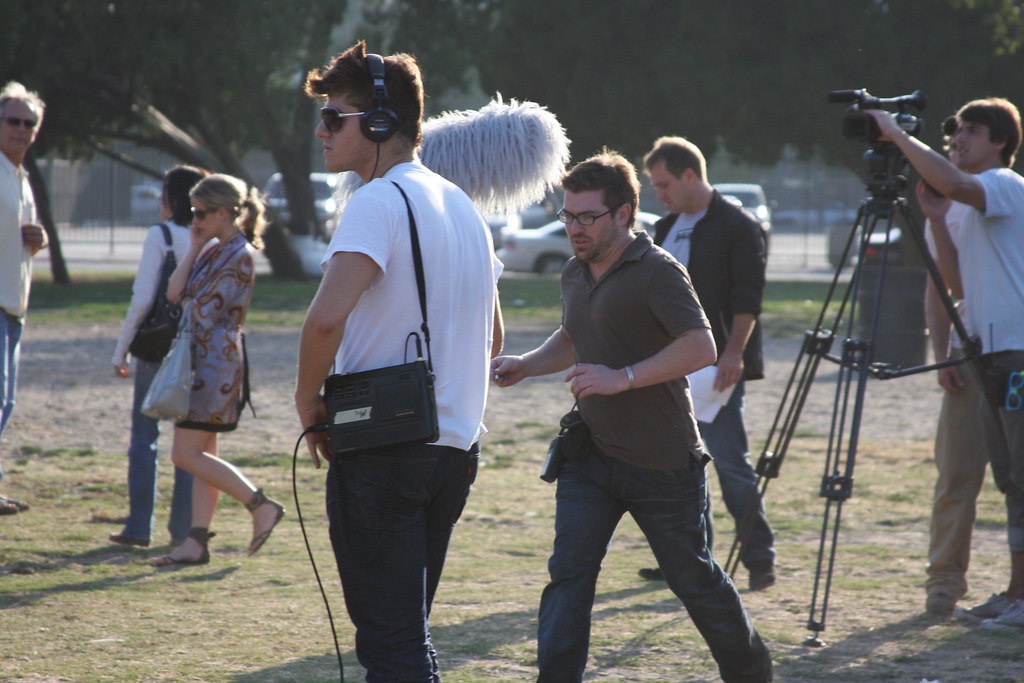
Throughout his career, Ricardo has worked with startups, established corporations, and cultural institutions. This diversity has taught him to be adaptable and to listen deeply. He approaches each project with fresh eyes, never assuming that what worked before will work again. This humility, combined with his technical skill, makes him a trusted partner for any design challenge.
Looking Forward
As technology continues to evolve, Ricardo is excited about the possibilities of immersive design—augmented reality, virtual spaces, and interactive installations. He is currently exploring how traditional design principles can be applied to these new mediums, ensuring that they remain user-centered and emotionally resonant. He is also committed to sustainability in design, advocating for digital products that are efficient, accessible, and mindful of their environmental impact.
This portfolio is a living document, continuously updated with new work and experiments. Ricardo invites you to explore the projects, and if something resonates, to reach out and start a conversation. Design is a dialogue, and he is always eager to listen.