Latest Insights

In the ever-evolving landscape of digital design, the tension between aesthetic appeal and practical usability remains a central challenge. Designers often find themselves at a crossroads, where the pursuit of visual innovation can clash with the need for intuitive user experiences. This article explores the nuanced interplay between bold visual trends and functional design principles, offering insights into how to strike a harmonious balance.
The Allure of Bold Visual Trends
Bold visual trends have a magnetic pull. They promise differentiation in a crowded digital space, capturing attention with vibrant colors, unconventional layouts, and striking typography. Neon accents, for instance, have surged in popularity, evoking a sense of energy and futurism. Such trends can breathe life into a brand, making it memorable and engaging. However, the allure of the new can sometimes overshadow the core purpose of a design: to communicate and facilitate.
When a design prioritizes style over substance, users may find themselves lost in a maze of aesthetics. A website that dazzles with animated gradients but buries its navigation is a classic example. The initial wow factor quickly fades when users struggle to find basic information. Thus, while bold trends can elevate a brand, they must be wielded with care to avoid alienating the very audience they aim to captivate.
The Foundation of Functional Design
Functional design is the unsung hero of user experience. It is the quiet architecture that guides users seamlessly from point A to point B. At its core, functional design is about clarity, efficiency, and accessibility. It ensures that a website is not only usable but also enjoyable to navigate. Key principles include intuitive navigation, readable typography, and responsive layouts that adapt to various devices.
Consider the humble button. A well-designed button is instantly recognizable, with clear affordance and feedback. It does not need to be flashy; it needs to work. Functional design often goes unnoticed when done well, and that is precisely its strength. It creates an invisible framework that supports the user's journey, allowing the content to shine without unnecessary friction.
When Trends and Function Collide
The collision between trends and function is not inevitable, but it is common. A designer might adopt a minimalist trend that strips away essential visual cues, leaving users unsure where to click. Or they might embrace a maximalist approach that overwhelms with information. The key is to understand that trends are tools, not mandates. They should serve the design's goals, not dictate them.
Design is not just what it looks like and feels like. Design is how it works. — Steve Jobs
This famous quote underscores the importance of function. A design that looks stunning but fails to work is ultimately a failure. The best designs are those where form and function are inseparable, each enhancing the other. This requires a deep understanding of user needs and a willingness to adapt trends to fit those needs rather than the other way around.
Case Study: The Rise of Neon in UI
Neon colors have made a significant comeback in user interface design, often associated with cyberpunk aesthetics and retro-futurism. When used thoughtfully, neon can create a vibrant, energetic brand identity. For example, a music streaming app might use neon accents to highlight interactive elements, making the interface feel dynamic and alive. However, neon can also cause visual fatigue if overused. High-contrast neon text on a dark background might look striking but can strain the eyes during prolonged reading.
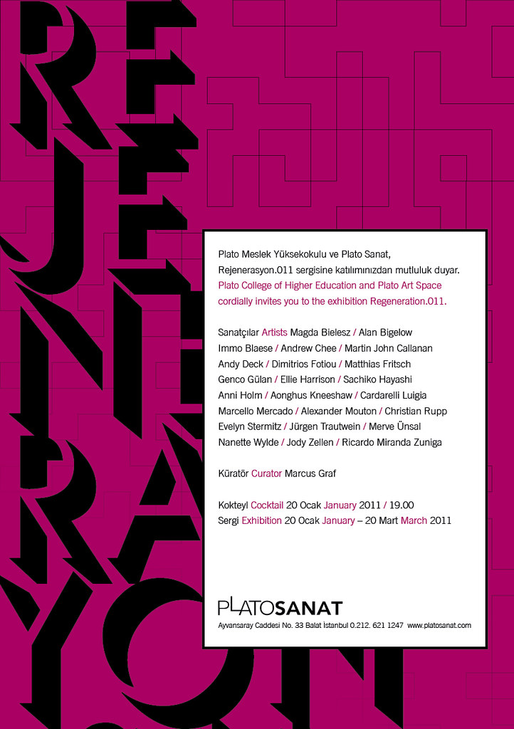
To integrate neon effectively, designers should use it sparingly as an accent rather than a primary color. Pairing neon with neutral tones can create a balanced palette that is both exciting and readable. Additionally, considering accessibility is crucial; ensuring sufficient contrast ratios for text and interactive elements is non-negotiable. For more on this trend, see our article on The Rise of Neon in UI.
Strategies for Balancing Aesthetics and Usability
Achieving balance is not a one-time act but an ongoing process. Here are practical strategies to ensure your designs are both beautiful and functional:
- Start with user research: Understand your audience's needs, preferences, and pain points. Design for them, not for awards.
- Adopt a mobile-first approach: Prioritize content and functionality on smaller screens, then enhance for larger displays.
- Use visual hierarchy intentionally: Guide users' attention to the most important elements through size, color, and spacing.
- Test with real users: Conduct usability testing at various stages to catch issues early and iterate.
- Embrace progressive enhancement: Build a solid functional base, then layer on visual enhancements that don't compromise usability.
These strategies help create designs that are not only visually appealing but also intuitive and user-friendly. They remind us that design is a discipline of empathy, not just aesthetics.
The Role of Accessibility in Modern Design
Accessibility is a critical component of functional design that is often overlooked in the pursuit of visual trends. An accessible design ensures that all users, including those with disabilities, can perceive, understand, navigate, and interact with a website. This includes considerations like color contrast, font size, keyboard navigation, and screen reader compatibility.

Incorporating accessibility from the start can actually enhance aesthetics. For example, a high-contrast color scheme not only benefits users with low vision but also creates a bold, graphic look. Similarly, clear and consistent navigation aids all users. By viewing accessibility as a design constraint rather than a limitation, designers can create more inclusive and innovative solutions. For a deeper dive into balancing these elements, check out Balancing Form and Function.
Conclusion: Designing with Purpose
In the end, the most successful designs are those that serve a clear purpose. They marry bold visual trends with functional design principles to create experiences that are both memorable and usable. This requires a shift in mindset: instead of asking "What looks cool?" we should ask "What works best for the user?" When aesthetics and functionality are in harmony, the result is a design that not only catches the eye but also stands the test of time.
As you embark on your next project, remember that trends will come and go, but the fundamentals of good design remain constant. Focus on creating value for your users, and let the trends follow. After all, a design that works beautifully is the ultimate goal.